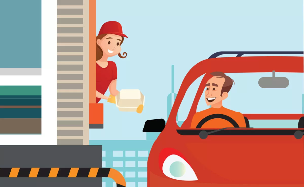
A Digital Menu Board Content – Keep it simple!
Being a digital marketing executive, I constantly seek innovative ways to upsell and promote products to customers. With numerous technology-based solutions available, it’s challenging to maintain simplicity. Marketers often rely on the “wow factor” to grab attention, using new, big, immersive, and hard-to-miss tactics.
Now while there is a time and place for this type of strategy, I feel the need to caution marketers and digital signage operators against doing this with Digital Menu Boards in restaurants and QSRs (in restaurants, and drive-through). Below I will talk about my most recent QSR drive-through experience and explain why I suggest that marketers resist the urge to create that “wow factor” and keep it simple when it comes to digital menu board content and strategy.
My recent experience
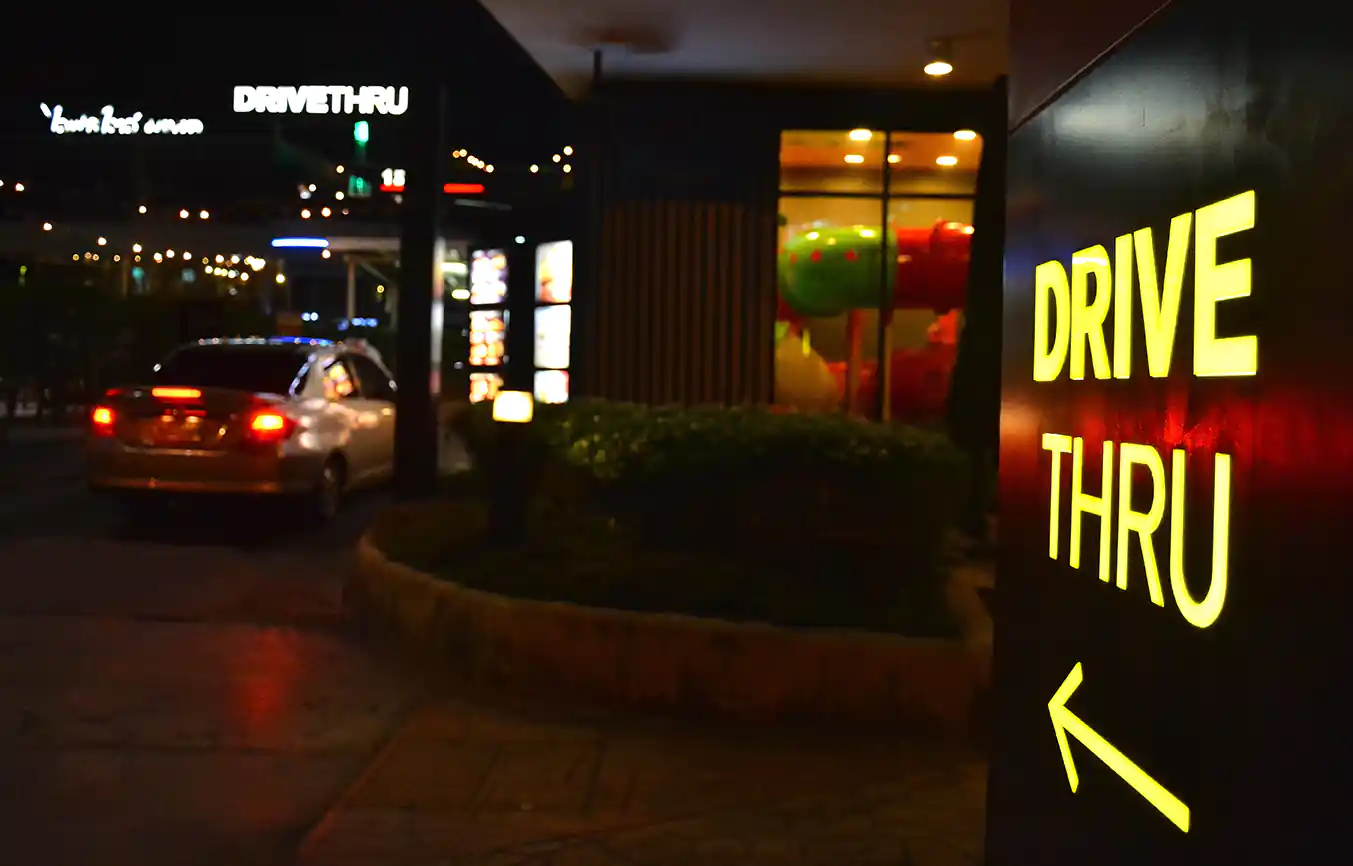
It was a warm summer night and I had just finished playing golf outside of the city, about 45 minutes away from where I live. As usual, the golf game took longer than expected and I was running late to get home to my wife. I asked myself, should I just go straight home and try to put together a small and very late dinner from what was left in the fridge? Or, should I pop into the drive-through of my favorite fast-food restaurant and grab a little something to eat on the way home? It had been so long since I treated myself to some fast food from my favorite QSR chain, and it was right there on my way home, so I decided to go for it.
It was late at night, and the drive-through line was short. I reached the ordering area without seeing the menu. This well-known fast-food chain’s ordering experience left me annoyed and frustrated, prompting me to write this blog post.
Let the frustrations begin
Arriving at the ordering area, a voice quickly greeted me and asked for my order. The drive-through digital menu board didn’t screen the actual menu, but instead showed a promotional video for a product I wasn’t interested in.
I requested a moment to decide my order, but the digital menu board changed to a layout with limited items. I wondered if that was the entire menu.
Being familiar with digital signage, I pondered content strategy while the person on the other end impatiently asked if I was still there. Without seeing the full menu, I hastily ordered something I knew they had.
On my way home, I realized the QSR failed to serve me as a customer by prioritizing the “wow factor.” If the complete menu had been shown when I arrived and remained until I ordered, I would have been happier. Similar mistakes happen with indoor digital menu boards too.
Lessons learned
The lesson here is that in many situations when it comes to digital signage, we must be careful not to lose sight of the actual goal of the digital signage itself. Be sure to understand the difference between entertainment and utility and decide which one you absolutely must achieve and which you can incorporate as ‘nice to haves’ when possible.
As marketers and content creators, we are always looking for cool and innovative ways to get our message across. However, as marketers, we must also be careful to ensure that our innovations don’t actually harm the customer experience at the same time. In this case, the goal of the indoor and drive-through digital menu boards was to increase sales, efficiency, and customer satisfaction. Unfortunately, it had the opposite effect on me. Not only was I not interested in learning about the latest products for sale by this restaurant, but the ordering experience also left me feeling rushed, disoriented, and dissatisfied. The food however was still delicious 😊.
Action items
When I finally got home, I was still bothered by how digital signage (an industry and product category I know and love) actually made my experience worse. So, I wrote a short list of things to remember when creating digital signage content for digital menu boards and here it is:
- Make the content visually appealing but KEEP IT SIMPLE.
- Remember, digital displays are there for customers to see the menu and order what they want.
- In a quick-service restaurant, the ordering process needs to be QUICK.
- Avoid full-screen video takeovers where the menu is not visible for more than 5 seconds.
- Instead, place your video advertising in a section of the main menu screen so that both play simultaneously.
- Your digital menu boards are not there to attract new customers. They are there to help your existing customers get what they want.
The above experience with digital menu boards in fast-food restaurants is relatable to other situations, such as encountering frustrating digital signage in airports. Flight status boards are meant to inform, not entertain. It’s frustrating when you’re in a hurry at the airport and the screens displaying important flight information are playing full-screen advertisements instead. It’s counterproductive and exasperating.
The Navori Labs solution to this problem:
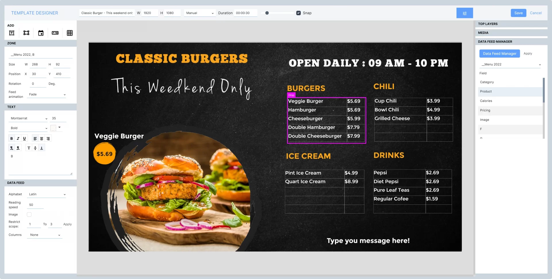
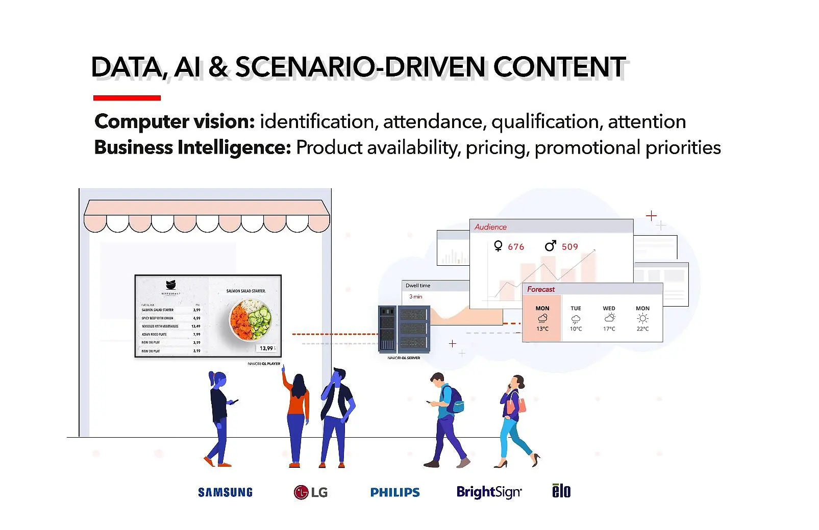
Navori is the award-winning, intuitive Digital Signage Software platform by Navori Labs. Navori includes built-in, data-driven content-triggering features that are very easy to configure and deploy regardless of technical skill level. Here is how data-driven content triggering can be used to avoid the annoying fast-food restaurant and airport examples discussed above:
- Have a sensor or camera near your digital menu board, or transportation status board that can detect when a person is standing in front of the screen.
- Use the data produced by your camera or sensor in real-time to automatically decide what content should be on screen at any moment, for example:
- If a person is present, continue to play the critical information (full menu, full flight data)
- If nobody is present, play your advertising loop, until the next person is present.
Learn more about this type of context-aware content triggering HERE
Recommended Hardware
Moreover, consider hardware features that align with the goal of maintaining simplicity and utility in digital menu board deployments. Opt for displays with clear visibility and minimal bezels, allowing customers to access menu information quickly and intuitively. Avoid distractions like full-screen video takeovers and prioritize layouts that prioritize the menu’s visibility and accessibility. For context-aware content triggering, leverage sensors or cameras integrated with the hardware to detect audience presence and adjust content dynamically. By selecting hardware components that prioritize functionality, reliability, and seamless integration with Navori’s digital signage solution, businesses can enhance the effectiveness and user experience of their digital menu boards while minimizing frustration and maximizing customer satisfaction.

In conclusion
In the end, we must be able to determine what the primary goal of any digital signage screen or deployment is, and respect it. I should be clear, there is still a place for visually appealing ‘wow factor’ advertising and promotion within utilitarian/informational digital signage content (digital menu boards, transportation status boards, conference room scheduling displays, etc.), I’m just saying that we need to be careful not to forget what the screens are actually there for which is to provide clear and concise information to the people that need it quickly.
About Navori Labs
Navori Labs, a Swiss software innovator, delivers premium digital signage and AI-driven marketing analytics solutions to businesses and organizations worldwide.
What differentiates our software is the fact it’s developed by our own team of engineers. For the last 20 years, Navori Labs has steadily invested in research and development. This lets us bring to market unique products that outperform other software solutions. It’s also why we back our products with professional maintenance contracts and support services.
We pay a lot of attention to our software’s simplicity, user-friendliness, and ease of use. Our software is designed for non-technical users, under the expert guidance of our in-house artistic director.
